
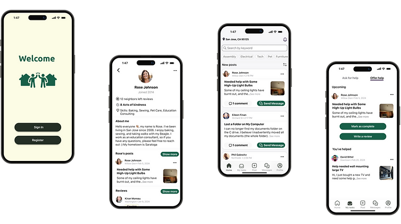
Welcome
UX/UI Project
01/2024 - 02/2024
Overview
The Welcome app serves as a dedicated platform to foster a support network within the community, enabling users to either extend help or seek assistance. This project unfolded over three weeks, offering a hands-on introduction to the Minimum Viable Product (MVP) methodology. The scope covered various stages, including data collection, drawing inferences from data, ideation and creation of multiple concepts, making strategic decisions, articulating and justifying design decisions, and producing deliverables.
The Challenge
In many neighborhoods, there's a significant gap between residents requiring support for straightforward, physical daily activities and those willing to offer their time and effort to assist neighbors and contribute positively to the community.
The Solution
Welcome is a mobile application designed to bridge the gap within communities by connecting individuals in the same locality who are in need of assistance with minor physical tasks and those who are willing to volunteer their time to offer help free of charge.
Deliverables
Survey
Competitive Analysis
Personas
User Stories
User Flows
Wireframes
Visual Design
User Testing
Clickable Prototype

Role

Client interviewer
UX Researcher
UI Designer
Usability Tester
Tools
Figma
Google Forms
Zoom
Maze
Adobe Color

Audience
Adults 25-65, Urban Areas and familiar in navigating online platforms

01
Discover
Survey
Methodology: An online survey was conducted to gather insights, utilizing personal networks and local social media groups. This approach resulted in 16 participant response.
The survey targeted adults aged 25 to 65, predominantly from urban areas, representing a diverse mix of racial and gender backgrounds. A majority are employed full-time, and all are frequent smartphone users with familiarity in navigating online platforms.
.png)
Either volunteering or seeking help expressed concerns about their privacy and safety when interacting with new people.
Showed a strong desire to assist with minor tasks within their community.
Reported difficulties in finding opportunities to connect with those in need.
.png)
Unaware of any platforms that facilitate connections with volunteers.
Respondents observed that existing platforms tend to focus more on providing online advice rather than facilitating real-world assistance.
In need of help felt embarrassed or judged for requiring assistance with tasks they perceived as minor.
Competitive Analysis
Strengths:
-
Hyperlocal focus.
-
Strong community engagement.
-
Trusted source for neighborhood news, events, and services.
-
Easy contact with other members through direct messaging or comments on the post.
Weaknesses:
-
Not primarily focused on help and tasks.
-
The interface is not as streamlined for the specific purpose of task coordination as the proposed app, potentially leading to usability issues for some users.
Opportunities:
-
Potential to develop features specifically for users seeking assistance or wanting to complete tasks.
Threats:
-
NextDoor is well-established and trusted, with a large user base that might be difficult to to draw user away.

Nextdoor

Lotsa Helping Hands
Strengths:
-
Specifically designed for organizing help, particularly in caregiving scenarios.
-
Uses a calendar-based system where tasks and needs are posted, and volunteers can sign up for specific time slots.
Weaknesses:
-
Niche focus (mainly caregiving), which might limit the user base and types of tasks.
-
Requires keyword or team name for participation, with unorganized search results.
-
The user interface is perceived as dull and unengaging.
-
Limited community connection: a private group consisting of manually added friends, not permitting contributions from outsiders.
Opportunities:
-
Broadening its horizons beyond caregiving could attract a wider audience.
-
A more engaging and lively user interface could really draw people in.
-
Threats:
-
Other apps with better interfaces and similar functions competition could poses a significant challenge.
Conducting a SWOT Analysis
This involves examining the strengths, weaknesses, opportunities, and threats of current platforms dedicated to community service, including NextDoor, Facebook local groups, and Lotsa Helping Hands.

Strengths:
-
Large, diverse user base.
-
Simple process for finding and joining local groups.
-
Versatile platform enabling a variety of group activities.
-
Easy contact with other members through direct messaging or comments on the post.
Weaknesses:
-
Lack of specific design for task assistance.
-
Vulnerability to scams.
-
Overwhelming amount of information for users to sift through.
Opportunities:
-
Potential for improving the platform's capability in facilitating exchanges of tasks and help, with robust verification and moderation processes.
-
Focusing on streamlining the user experience for task assistance could distinguish the platform.
Threats:
-
Facebook's omnipresence and versatility pose a significant challenge in competing effectively.
Insight summary
-
While platforms like NextDoor and Facebook offer broad community engagement, my app can focus specifically on task and help exchange, offering a more targeted and efficient experience.
-
By focusing on a safe, user-friendly, and moderated environment, I can build trust and ensure a positive experience, addressing common issues found on platforms like Facebook.
-
Unlike Lotsa Helping Hands, my app could cater to a wider array of tasks, not just caregiving, filling a gap in the market. And also make it easier for community to volunteer.
User interviews
I had the opportunity to connect with two users online who shared their emails for more in-depth discussions. During our conversations, I explored their strategies for handling small tasks when faced with obstacles, their go-to resources for support, the primary challenges they encounter, and the features they would value in a supportive application.
Key Takeaway:
-
Both individuals primarily rely on their network of family and friends for help with minor tasks. When this option is not available or feasible, they consider hiring professionals, which can be expensive.
-
One of the interviewees engages in volunteer work within his community, preferring organizational involvement over centralized platforms.
-
A mutual concern for both users was the safety issues associated with interacting with strangers online. They stressed the importance of a trustworthy verification process to confirm the authenticity of app users.
-
They expressed a desire for an intuitive app that simplifies posting tasks and finding assistance. Key features they seek include:
-
Verification of identity
-
Verification of user skills
-
Effective in-app communication
-
Persona


02
Define
User Stories
Secondary
Main Focus
As a user, I want a feature that allows for robust identity verification, so that I can make sure the people I interact with on the platform are genuine. (high)
As a user, I want tools to assess the trustworthiness and reputation of community members, so that I can engage confidently and ensure a positive experience for everyone involved. (high)
As a user, I want quick and effective communication tools, so that I can coordinate tasks, share skills, and address queries efficiently without feeling overwhelmed. (high)
As a user, I want to be confident that individuals offering help are capable of completing the tasks they sign up for, so that I can rely on the assistance provided without wasting time or facing disappointment. (high)
As a user, I want a badge or certification system for achieving milestones, so that my credibility is visible and can be enhanced within the community. (Medium)
As a user, I want a bulletin board or community forum, so that I can engage with the broader community for advice, task sharing, or general queries.(Medium)
As a user, I want customizable notification settings, so that I can control the flow of information and avoid feeling overwhelmed.(Low)
User Flows
The sign-up process focuses on confirming the authenticity of each user. This is key to ensuring that all members are genuine.
For volunteers, this setup makes it simple to look through tasks, view the profiles of those who have posted these tasks to assess their reliability, and get in touch with them. Volunteers are also able to confirm tasks they'll undertake and provide feedback afterwards.
Likewise, for individuals who post tasks, this system enables them to get messages from volunteers, evaluate their skills and reliability by checking their profiles. This helps in ensuring that they can count on volunteers for the successful completion of tasks.

Sketches


Usability testing feedback
By asking for feedback from 2 individual users, I learned that improvements were needed.
-
User 1 was confused during the registration process regarding whether to use her full legal name or a preferred nickname. This confusion carried over to the ID verification step, where it was revealed that the app actually requires the full legal name.
-
Additionally, she expressed a need for more detailed information about the app's privacy policy to feel comfortable sharing her personal information.
-
User 2 suggested improvements for the home screen, specifically to add the time and location for each task posted.
-
She also proposed a feature that allows users to report others for inappropriate behavior.
Wireframes
-
After learning from the feedback on the paper prototype, I made a few changes and moved on to create low-fidelity wireframes in Figma.
-
I introduced separate fields for the user's first and last names and added options for users to learn more about the identity verification process.
-
I also made sure the home screen shows both location and time information, making it more convenient and improving the user experience.
-
In the end, I increased the number of wireframes to make the app's flow more complete and smooth, ensuring users have a seamless experience throughout the app.


User testing
I conducted usability testing on the low-fidelity, clickable prototype using Maze.
Tasks
The main workflows I tested were:
-
Register on the app
-
Volunteer for tasks
-
Post task
-
Leave reviews
Outcomes
Positive Results
Everyone completed their tasks smoothly without any issues.
The feedback praised the app for its clean and simple design, emphasizing its ease of use and user-friendly interface.
User pointed out that the comment and message buttons looked too alike, suggesting that making them more distinct could improve clarity.
User noted that an invitation sent through a message wasn't immediately noticeable.
Areas for Improvement
Solution
To address the accessibility issues identified during user testing, I implemented the following changes:
-
A user noted the similarity between the comment and message buttons, recommending a clearer distinction for better clarity. In response, I redesigned the message button to be more eye-catching as a call-to-action (CTA), differentiating it from the comment button.
-
Another user pointed out the difficulty in quickly noticing an invitation sent via message. To improve this, I enhanced the visibility of the invitation, making it more prominent and easier to spot.


03
Develop
As I progressed into the development stage, I focused on shaping the app to serve its primary goal: connecting local individuals who need help with small tasks or wish to volunteer their time.
I selected a color palette that includes shades of deep green, creamy yellow, dark green, and light grey. This choice aims to evoke trust, tranquility, and growth, offering an inviting and user-friendly interface. It encourages user interaction and nurtures a sense of belonging within the community.
Branding
For the app's name, I sought something memorable and significant. "Welcome" stood out as it embodies openness, warmth, and a community spirit. It's as if we're inviting users into a space where they can seek assistance or provide it, ensuring everyone feels included and valued.
Considering the app's diverse user base, which ranges from young adults to seniors, I chose a straightforward and legible font: SF Pro. This font ensures the app is accessible to all, facilitating easy navigation and interaction. It allows users to effortlessly find what they're looking for or to extend help, making the app a friendly space for individuals of any age or tech proficiency.


-
Through my experience, I've learned that building an app is really about being flexible and open to change. It's crucial to listen closely to what users say, watch how they use the app, and be ready to make improvements. This willingness to adapt is key to creating an app that truly meets the needs of its users.
-
I've also realized how important it is to keep the design simple and clear. For example, making sure users can easily tell the difference between the comment and message buttons, and that invitations stand out, really matters. A clean, user-friendly interface greatly increases how much people use and enjoy the app.
-
Additionally, focusing on the app's main purpose to connect people who need help with those who want to volunteer nearby has highlighted the importance of having a clear and meaningful goal. This focus doesn't just guide the app's design and development; it also resonates with users by fulfilling a real need in their community.