
Motherhood
UX/UI Project
12/2023 - 1/2024
Overview
The Motherhood app is a designed platform for mothers who are looking to build friendships with other local mothers and fostering real-life social interactions for themselves and their children. This project, a client-driven assignment, spanned three weeks and provided a practical introduction to the design sprint methodology. The scope included the development of a low-fidelity prototype, with two user flows designed to validate the app's concept and assess its usability. Following the initial phase, an extra week was dedicated to developing the app's branding and a high-fidelity prototype.
The Challenge
Mothers face challenges in socializing and arranging children's activities with local mothers due to varied backgrounds, cultural differences, life stages, and shyness. Online platforms haven't eased these issues, as geographical differences, limited information, and uncertain common interests hinder in-person connections.
The Solution
The Motherhood app is designed to support women at every stage of motherhood to connect with other local mothers, providing a platform for creating profiles with personal and children's details. It features a matching algorithm for suggesting possible mother friends, where users can swipe to match and initiate chats. The app emphasizes a comfortable, secure environment for mothers to form friendships and arrange in-person meetups.
Deliverables
Survey
Competitive Analysis
Personas
Empathy
Journey map
User Stories
User Flows
Story Board
Wireframes
Visual Design
User Testing
Clickable Prototype

Role

Client interviewer
UX Researcher
UI Designer
Usability Tester
Tools
Figma
Google Forms
Zoom
Maze
Adobe Color

Audience
Women in various stages of motherhood

01
Discover
Client interview
I started the project by interviewing the client, a new mother who had recently moved from New York to California. I learned that she found it challenging to make friends with other mothers whose children were about the same age as hers. She tried a Facebook group but struggled to form real friendships, as the members were widely scattered and shared little personal information. Additionally, she received spam messages from unknown members of the group. She was in search of a reliable application where she could connect with other local mothers, have the ability to choose whom to connect with, and get to know them personally before deciding to meet up in person with their children.

Survey

83.3% of respondents reported facing challenges in making new friends, particularly with other mothers who have children of similar ages.
Motivation for seeking mother friends
Playdates for Children
Socializing

To better understand my target users, I created the survey, laying the groundwork for my design. The focus was on the real-life challenges mothers face in making new friends. I collected responses from 18 individuals via an online survey. Here are the key findings:

Over 55% of the participants used local Facebook groups for mothers to connect with other mothers.

15% used the Peanut application for online connections with other mothers.
Challenges in Making Genuine Online Connections

Emotional Support
Insufficient Information for Trust Building
Diverse Backgrounds
Safety Concerns
Competitive Analysis
I moved forward with my research by taking a closer look at the competition in the market. My focus narrowed down to two notable mobile apps mentioned in my findings: Facebook and the Peanut app. Using a SWOT analysis, I dissected their strengths, weaknesses, opportunities, and threats. This methodical approach was essential to pinpoint opportunities for the motherhood and positioning.
Facebook Mothers Groups


Strengths:
-
Extensive user base.
-
Easy to use and broadly accessible.
-
Variety of content.
Weaknesses:
-
Privacy issues.
-
Too many forums leading to information overload.
-
Lack of detailed user profiles, affecting trust.
-
Limited reach due to geographical constraints.
-
Spam messages.
Opportunities:
-
Motivate users to create more comprehensive profiles
-
Create exclusive, private spaces for mothers to connect
-
Empower users with control over their connections to prevent spam and enhance safety.
Threats:
-
Growing competition from niche parenting apps.
Peanut app


Strengths:
-
Tailored specifically for mothers.
-
Features for connecting in person, like matchmaking.
-
Includes a community board and a podcast.
-
Visually appealing interface.
Weaknesses:
-
Primary focus on the podcast and forums, potentially overshadowing meetup features.
-
Restricted user base in certain regions.
-
Subscription or payment required to network with other mothers and unlock full features.
Opportunities:
-
Expand free access to certain features to attract more users.
-
Promote the meetup feature to encourage real-life connections.
Threats:
-
Other free parenting applications and platforms.
Empathy map, Personas, Journey map
With all the information gathered, I have created an empathy map, user personas, and a journey map to make sure they were forefront in the design process throughout, especially in the early stages of a design sprint where there wasn't sufficient time to conduct user interviews.


02
Define
User Stories
Once I understood the users and their pain points, I was prepared to explore potential solutions. However, it was essential first to revisit the original problem to ensure I was on the right track. To facilitate this, I developed numerous user stories, enabling me to empathize with the users' perspectives. These stories guided my decisions on what to include and helped define the minimum viable product.
Main Focus
As a mother looking to connect with others, I want to feel safe and assured that I am interacting with genuine users. (high)
As a mother looking to connect with others, I want to see others's profiles who are at the same stage in life or have children of similar ages to mine. (high)
As a mother looking to connect with others, I want the ability to control and select my preferred connections. (high)
As a busy mother using the app, I need a simple and intuitive interface that is easy to navigate. (high)
As a mother looking to connect with others, I want to view and participate in events that I can join with other app users. (Medium)
As a mother looking to connect with others, I want an app featuring forums where all users can post and discuss various topics. (Medium)
As a mother looking to connect with others, I want to have the ability to chat with everyone on the app, even those I haven't matched with. (Low)
Secondary
User Flows
With the foundation of user stories, I then progressed to developing my initial ideas on user flows.
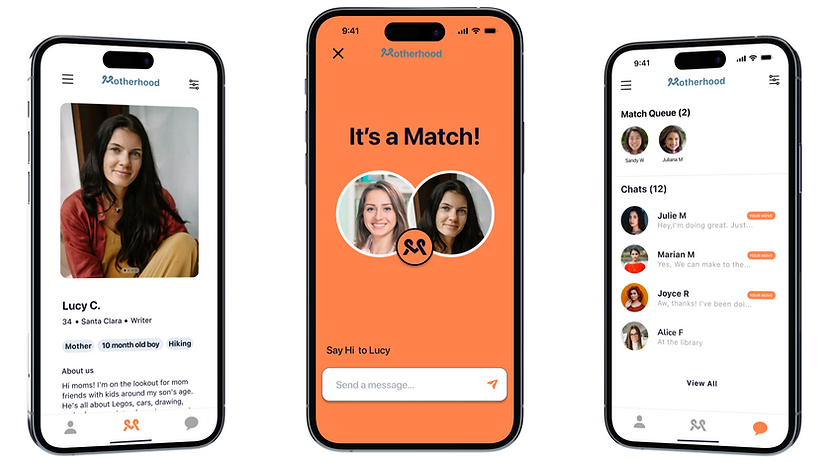
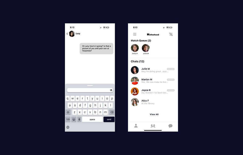
The first user flow illustrates the actions a user can take to sign up for the app, including the process of verifying their number and profile before connecting with other mothers. This approach provides users with a sense of safety and enables the app to suggest potential matches based on location and children's ages.
The second user flow illustrates the actions after users create their profiles. They can either learn how to use the swipe feature or immediately review profiles of other moms. They can swipe right to express interest in connecting or swipe left to pass and view another profile. When two mothers swipe right on each other, they become a match and can start chatting. This method gives users control, interaction, and easy navigation in the app.


1)

2)
Story Board
This is a visualization of Amy as she uses the app to connect with other local moms.

Sketches
With the user flows and storyboard completed, I was ready to begin sketching and visually imagining the interface of the app. I did some quick sketches of the app design and layout through exercises like Crazy 8s, where I drew eight rough sketches of potential wireframes.
Then, I thought more in-depth about how specific components would work with user stories that make the user feel safe, connected, and in control. The key thing in designing this was to ensure that users provide more detailed information in their profiles. This way, users will know that the people they're meeting through the app are real and safe, not just fake profiles or potentially harmful. And they'll have a better chance of finding the right match, and it also saves time in searching for similar friends. Lastly, by using swiping to match, they can manage whom they interact with based on their preferences, so they don't feel overwhelmed by too many connections, messages, or people they don't want to connect with. Once all the components were fleshed out, I created some paper prototypes and tested them with users to see if the flows made sense.


Usability testing feedback
By asking for feedback from 2 individual users, I learned that the profile setup needed improvements.
-
User 1 felt overwhelmed by the amount of information required on one screen. And she would end up skipping adding some information.
-
User 2 expressed a lack of motivation to complete optional fields

Wireframes
With consideration of the feedback that I received from the paper prototype, I did designed wireframes using Figma.
and added more screens to motivate users to provide more information on their profiles by:
-
Display only a single question on each screen.
-
Provide guidance on each answer
-
Including a clear button for progressing to the next step.
-
A completion progress bar that visually represents the user's progress through the steps.


User testing
I began user testing by recruiting three people, including my client, to participate in usability tests using Maze. I designed a series of tasks for the participants to complete within the prototype. The goal was to pinpoint areas where users might struggle or have trouble navigating.
Tasks
The main workflows I tested were:
-
Creating a profile.
-
Swiping to match with other mothers.
-
Messaging their match.
Outcomes
Positive Results
Everyone completed the tasks without any errors.
The app's design felt familiar, much like dating apps, and was user-friendly.
The clean layout and the progress bar, which provided positive feedback, were especially appreciated.
Areas for Improvement
One left-handed participant had trouble clicking the 'next' button on the right side.
The text box for input was initially too small for comfortable finger use.
A change to the photo-adding feature, like replacing the '+' symbol with a camera icon for clarity.
.png)
Solution
To address the accessibility issues identified during user testing, I implemented the following changes:
-
"Next" Button Placement: Originally located on the right, the "Next" button was not easily accessible for left-handed use. To rectify this, I repositioned the button to the center. This central placement ensures that the button can be comfortably reached with both the left and right thumb, accommodating all users regardless of their hand preference.
-
Text Box Size: Feedback indicated that the text box for entering information was too small for convenient finger use. In response, I enlarged the text box. This size increase facilitates easier interaction, making it more user-friendly, especially for those using the app on devices with smaller screens.
-
Photo Addition Feature: Based on the suggestion to make the feature for adding photos more intuitive, I replaced the '+' symbol with a camera icon. This change makes the purpose of the button more evident and aligns with standard design practices, making it instantly recognizable for users accustomed to common interface symbols.


03
Develop
In developing an app geared towards mothers, I was inspired by the themes of new beginnings, warmth, positivity, and trust. The concept of a sunrise in the landscape perfectly embodies these ideas, offering deep symbolism and a spectrum of emotions that align with the app's core values. The chosen color scheme of blue and vibrant orange not only complements this theme but also resonates strongly with my target audience, enhancing the app's appeal and effectiveness.
Branding
For the logo, I aimed to create an iconic representation that intertwines the themes of motherhood and connection, ensuring it's memorable and relevant. The resulting "M" symbol, suggestive of both 'Motherhood' and two people engaging in a handshake, encapsulates this.
Considering the app's primary users – mothers – I opted for a minimalist and easily readable typography. This choice is intended to provide a clean and straightforward layout, facilitating quick and effortless interaction for mothers in their often hectic lives.


-
This project, driven by the client's needs, was a great opportunity for me to learn how to creating a minimum viable product, without taking on too much at once. It kept me focused on what the client really needed to address, even though I was tempted at times to add more features.
-
This experience was also my first real dive into understanding design systems and creating a design that fits within specific guidelines.
-
I've learned that while you might start a project thinking you know what to focus on in terms of design, research is key and can quickly shift your perspective.
-
Regarding this project, I initially set out to design a completely new app, which turned out to be quite time-consuming. Halfway through, I realized that it would have been more effective to start by improving the existing app and adding features that would help my client achieve her goals.
.png)